
How to (Quickly) Prototype New Features
A guided approach to prototyping new ideas with an existing product

Hey, I’m Colin! I help PMs and business leaders improve their technical skills through real-world case studies. For more, check out my live courses, Technical Foundations and AI Prototyping.
The ability to quickly prototype and validate new features is becoming a crucial skill for product managers. This guide will show you how to efficiently prototype new features, regardless of your starting point or technical expertise.
Getting started
In this post, we’ll be prototyping new features on top of an existing dashboard. Here’s what it looks like in Figma:

Let’s dive into a few approaches to get started.
Starting from Figma
If you already have a Figma design, you're in luck. Modern AI tools can translate your designs into working code with impressive accuracy. Here's how:
Create an account with Builder.io
Open your design in Figma and select the starting frame
Run the Builder.io plugin to generate code

Builder.io integrates directly with Loveable, so you can easily move your design directly into an AI code editor. Here’s what this looks like as a direct Lovable import:

For use with other tools (Bolt, Replit), select View Code in Builder.
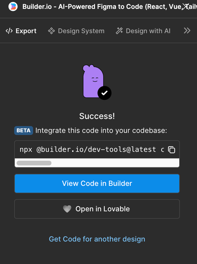
Once in Builder, generate code to match the design. The result should have a ‘Sync to Codebase’ button in the bottom right corner.

You can then import this code into Replit or Bolt using the terminal. Here’s the result in Bolt:

Not bad! There are definitely some differences between our real product and this prototype, but this is convincing enough for testing new ideas.
Starting from a Design System
If you don't have a specific design but want to maintain consistency with your existing product, you can leverage your existing design system. If you have actual React components to use, you can upload them directly to your project in Bolt / v0 / Replit.
If you don’t have existing React components, use a prompt like this one with a screenshot of the view you want to start with in your app.
Prompt #1
You are tasked with creating a component library based on a screenshot, using NextJs, React, and Tailwind CSS. All components should be custom-made to match the screenshot as closely as possible. Follow these instructions carefully:
Analyze the provided screenshot. Determine the fonts, colors, and design elements used.
Make a plan. Dont write any code.
Prompt #2
2. Identify distinct UI components in the screenshot. These may include, but are not limited to:
◦ Buttons
◦ Input fields
◦ Navigation bars
◦ Cards
◦ Modals
◦ Typography elements
3. For each identified component:
a. Create a React functional component
b. Use Tailwind CSS classes to style the component, matching the visual design in the screenshot
c. Ensure the component is responsive and accessible
d. Add any necessary props for customization
e. Include a brief comment describing the component's purpose
4. After creating all individual components, create an index page that imports and displays each component with example usage.
Remember to use only custom-made components and Tailwind CSS classes. Do not use any external libraries or pre-built components. Strive to match the visual design in the screenshot as closely as possible while maintaining good coding practices and component reusability.

Do not use shadcnui.
As a result, you should have custom components that are easy to modify and can be reused.
Here’s what this looks like in Bolt:

